Joined: Jul 10, 2009
Posts: 2218
Location: Poland
So if you want to comment the work, do it here

Joined: Jul 10, 2009
Posts: 2218
Location: Poland
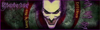
Good going guys. Heraclas your work is cool but please make it a bit closer to out original sig sizes. That is only if you want to, as there are no rules stating that you should. But as the task is to create a sig then it would be nice to keep the siggalific sizes.
Joined: Aug 01, 2009
Posts: 432
I would concur with Sinister, Heraclas. Also, make sure you turn your sig off when you post. This was in the requirements I believe.

Joined: Aug 01, 2009
Posts: 432
okay... There is supposed to be a border on mine, but it's not showing up on the post, but it is in Photobucket. Anyone else see the border?
Joined: Aug 29, 2009
Posts: 1468
Location: Germany
good sigs Immo & J
sry about my sig ,wich was not turned off.
about the size hmm, it kills the whole sig when i rezise it.
and this sig was my entrance and is there something i did wrong then i'm disqualified now.
(pm it blocks hard the creativity when you can only use 400x120 , i think the sigs here will never be in use .
it is a chance to show your style / creativity / to have nice ideas for a sig ,4 exampl. fliped size and so on. )
good luck 4 ya all

Joined: Aug 11, 2009
Posts: 2530
Joined: Aug 11, 2009
Posts: 2530
Joined: Aug 11, 2009
Posts: 2530
Joined: Aug 29, 2009
Posts: 1468
Location: Germany
i post my 2. too , you'll killn mme ,cuz of the size but i spent too much time for the tag
and it is funny lol
pm J ...i see no border (on the top of ya sig)
Joined: Aug 11, 2009
Posts: 2530
Joined: Aug 09, 2009
Posts: 501
Location: Texas
So, where do I pick up my winnings...?

Joined: Aug 01, 2009
Posts: 432
I got to admit, I am impressed Hellboy
Joined: Aug 09, 2009
Posts: 501
Location: Texas
I got to admit, I am impressed Hellboy
LOL, thanks but I just did it cause Immolation wanted more people to play. I don't take my sigs as seriously as you fellas. No brushes, filters or shading for me. (lazy I am) � I got my idea from your sig. It looks like he is riding a motorcycle and I went from there. �By the way, cool how you swapped heads to get him looking rt at ya. They all look as good as to be expected from your crew.
Task1 B: The phrase "ModernKnight" made me think of the British soldier that has taken the place of the Knights that once protected their Kings and Queens. Hard to tell but I tried to fade a picture of Knights in battle over a pic of modern day British soldiers in battle in Afghanistan. If I weren't so lazy I would look for a better font but it will just have to do.
Joined: Jul 10, 2009
Posts: 2218
Location: Poland
oh Hellboy

love what you did with task1 a

Joined: Aug 01, 2009
Posts: 432
I still need to get my part 2 up. I have the idea and what it should look like when finished, but unfortunately I currently lack the drive to actually put anything together. If I can't get it together soon, I am just going to back out of the competition. No sense in making people wait for something I might not have the ambition to do.


